
8:56 pm
Moderators
May 22, 2012
Neverthrive said
I don’t disagree, but I ain’t the one who’s going to be potentially wearing it.
fuuuuuck that!
my assumption is that you mean you dont think youll make it home.
okay, your logic is sound enough… but if you design the shirt [and youve pretty much already done that, kudos for the rapidity], ill pay for an extra myself to make damn sure i can mail you one. assumin you wont make it home.
i gots to. psyral knows.
[addendum] uh, we didnt stop bein flh, did we…?
nah. nah, we didnt. zcool.
had me worried for a second.
Whoop Whoop scruffy :
SPOOKYtheFUNGIawfully paranoid, arent you?
9:10 pm
July 27, 2012
scruffy said
Neverthrive said
I don’t disagree, but I ain’t the one who’s going to be potentially wearing it.fuuuuuck that!
my assumption is that you mean you dont think youll make it home.
okay, your logic is sound enough… but if you design the shirt [and youve pretty much already done that, kudos for the rapidity], ill pay for an extra myself to make damn sure i can mail you one. assumin you wont make it home.
i gots to. psyral knows.
[addendum] uh, we didnt stop bein flh, did we…?
nah. nah, we didnt. zcool.
had me worried for a second.
Aw, well that’s cool.
Also, I dunno, the site no longer seems to be ‘faygoluversheaven’ so I wasn’t sure how appropriate the ‘h’ was.

9:11 pm

January 28, 2016
scruffy said
Neverthrive said
I don’t disagree, but I ain’t the one who’s going to be potentially wearing it.fuuuuuck that!
my assumption is that you mean you dont think youll make it home.
okay, your logic is sound enough… but if you design the shirt [and youve pretty much already done that, kudos for the rapidity], ill pay for an extra myself to make damn sure i can mail you one. assumin you wont make it home.
i gots to. psyral knows.
[addendum] uh, we didnt stop bein flh, did we…?
nah. nah, we didnt. zcool.
had me worried for a second.
Damn scruffy even tho u can be stuck on ur set in stone ways, u are a real ninja for havin peeps backs like dat Much Clown Luv homie i have mad respect 4 u.
Whoop Whoop SPOOKYtheFUNGI :
scruffy9:14 pm
January 28, 2016
And neverthrive MCL to u as well 4 takin time out to fuck wiit the design even tho u feel like u wont get one ur da shit
Whoop Whoop SPOOKYtheFUNGI :
scruffy9:20 pm
Moderators
May 22, 2012
SPOOKYtheFUNGI said
Damn scruffy even tho u can be stuck on ur set in stone ways,
not really.
u are a real ninja for havin peeps backs like dat Much Clown Luv homie i have mad respect 4 u.
great, but that aint what im out for. he deserves to have one, and i gotta pay forward, anyway.
most people in here are real ninjas. not all, but most.
neverthrive: ‘flh’ is still current and appropriate.
if that causes people confusion… shrug. oh well.
Whoop Whoop scruffy :
SPOOKYtheFUNGIawfully paranoid, arent you?
9:21 pm
Moderators
August 12, 2012
Neverthrive said
scruffy said
Neverthrive said
I don’t disagree, but I ain’t the one who’s going to be potentially wearing it.fuuuuuck that!
my assumption is that you mean you dont think youll make it home.
okay, your logic is sound enough… but if you design the shirt [and youve pretty much already done that, kudos for the rapidity], ill pay for an extra myself to make damn sure i can mail you one. assumin you wont make it home.
i gots to. psyral knows.
[addendum] uh, we didnt stop bein flh, did we…?
nah. nah, we didnt. zcool.
had me worried for a second.
Aw, well that’s cool.
Also, I dunno, the site no longer seems to be ‘faygoluversheaven’ so I wasn’t sure how appropriate the ‘h’ was.
We still Faygoluvers Heaven on Facebook and almost everyone uses FLH for short
Whoop Whoop PunkRockJuggalo :
scruffy9:28 pm
January 28, 2016
scruffy said
most people in here are real ninjas. not all, but most.
Im still learning that remember imma newb to da forums.
10:08 pm

January 5, 2015
Dope job man. The white outline looks the best, imo.
And yeah we’re still flh
![]()
10:32 pm
February 13, 2015
Neverthrive said
Also yellow butterflies on green outline, because.
Thats gross dude. Im all for the second draft. Maybe leave the FLH Forum green. But if it looks like butt fuck it….
I really dont like the block around meet up massacre. And i would like to see faygoluvers.net so we can shout the site out…
But what ever it is i would love it and thank you @neverthrive.
@spookythefungi @scruffy is one one of the realist…….
Whoop Whoop bayAreaShaman :
SPOOKYtheFUNGIYOU KNOW THEY AINT NO SUCH THING AS LEFTOVER CRACK!!!- Leftover Crack
12:29 am
July 27, 2012
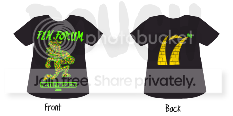
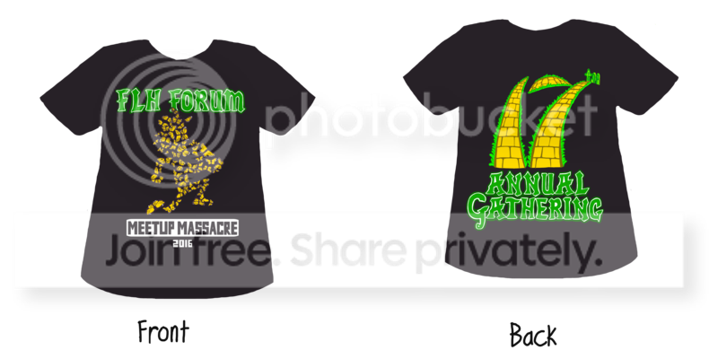
Two more drafts.
![]()
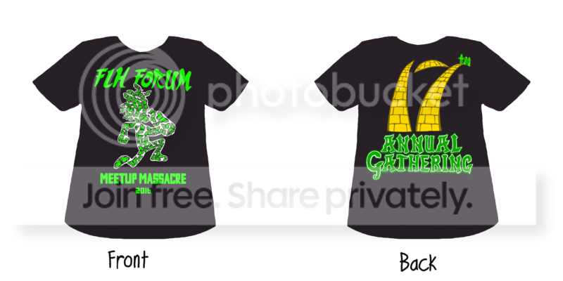
![]()
Whoop Whoop Neverthrive :
Psyral, SPOOKYtheFUNGI, scruffy
1:07 am
January 5, 2015
Neverthrive said
Two more drafts.
this one
2:40 am
October 30, 2013
Yay! It’s Neverthrive season again! ![]()
1) I *love* your original butterfly Hatchet/Faygoman. WITHOUT the bordering. I think the border muddies the whole idea by putting too fine a point on “what it is” and wrapping color around such an asymmetrical/obtuse object makes it look like an indistinct blob from a distance. WITHOUT it, it can more easily be identified as a Hatchetman (IMO). Against a black background looks best to me.
2) I think the blocky meetup lettering is fine but I think it’s the “2016” that makes it look a little…. off somehow.
3) I do NOT like the FLH Forum font.
4) I like the IDEA for the number on the back but…
5) The ‘7’ on the back looks like it’s tryin’ to be a palm tree on a hotel sign somewhere. Not feeling it. I know the pictures are just mock-ups but the overall design (the numbering that is) doesn’t seem to inhabit/make use of its space very well. Like it’s listing to the left to accommodate the top of the ‘7’. And the crossbar (is that what it’s called?) of the ‘7’ also seem a bit too small.
Possible suggestions:
Keep the original butterfly design. Make it take up the majority of the front of the shirt. It’s such a cool design that I think that that’ll be able to cover the whole “butterfly tangent”. On the back, it looks as though you are trying to integrate the Yellow Brick Alleyway as it looks on the album cover (going over the hills n’all) but I think using the arcing direction too much gives it the look of a certain font no matter how you size it. As far as the writing itself goes, I’d really like to see a mix of ACTUAL “Wizard of Oz” fonts (Juggalo stylized of course) WITH the ones from the “Wizard of the HOOD” album cover. Maybe put the FLH Forum in WoO fonts and the MeetupMassacre stuff in WotH stuff. With the butterfly getting its love as the primary image, I think the fonts on both the front and back should be consistent with each other as being ALL identifiable as referencing the WotH. As they are now, it doesn’t look like they have anything to do with each other.
Oh ps, what about some numbering on a sleeve?
But that’s just my unabashed .02. You always knock that shit out! My FLH shirts are some of my most prized Gathering schwag because WE are the only ones with ’em and they are some Psychopathic freshness you can’t get at just ANY merch booth!
Looking forward to the progression! ![]()
[edit] Hadn’t seen the newer drafts…. I *do* really like the font yer using for the “Annual Gathering” thing!! (I’d just move the whole thing down about a 1/3 more. Looks too high up to the collar of the shirt.
Whoop Whoop Cheshyr :
SPOOKYtheFUNGI, scruffy"Your lack of online social presence makes it difficult for me to predict your needs..." - 2064: Read Only Memories
3:26 am
Moderators
May 22, 2012
Cheshyr said
I think the border muddies the whole idea by putting too fine a point on “what it is”
that is true, it does do that.
and wrapping color around such an asymmetrical/obtuse object makes it look like an indistinct blob from a distance.
its gonna be indistinct at some distance no matter what, unless a much, much simpler design is chosen.
WITHOUT it, it can more easily be identified as a Hatchetman (IMO).
you mean, ‘misidentified’…?
2) I think the blocky meetup lettering is fine but I think it’s the “2016” that makes it look a little…. off somehow.
its cuz the 6 is styled too close to a lower case b. betcha.
youre seeing 201b, instead of 2016. or maybe 20Ib.
5) The ‘7’ on the back looks like it’s tryin’ to be a palm tree on a hotel sign somewhere.
i read it as paths goin over hills. as you imply later.
if that is the intention, a quick and dirty solution: little sprigs of grass on the sides of the roads, scaling back to add perspective push.
As far as the writing itself goes, I’d really like to see a mix of ACTUAL “Wizard of Oz” fonts (Juggalo stylized of course) WITH the ones from the “Wizard of the HOOD” album cover. Maybe put the FLH Forum in WoO fonts and the MeetupMassacre stuff in WotH stuff. With the butterfly getting its love as the primary image, I think the fonts on both the front and back should be consistent with each other as being ALL identifiable as referencing the WotH. As they are now, it doesn’t look like they have anything to do with each other.
do you have these fonts?
cuz layin that out by hand would be a strain. could be, i should say.
Oh ps, what about some numbering on a sleeve?
i imagine sleeve printing will add notably to the price.
that said, ive been in favor of it since the first shirts.
My FLH shirts are some of my most prized Gathering schwag because WE are the only ones with ’em and they are some Psychopathic freshness you can’t get at just ANY merch booth!
well, quasi-psychopathic. enough officialness for me.
but yeah, hell yeah.
Whoop Whoop scruffy :
SPOOKYtheFUNGIawfully paranoid, arent you?
4:24 am
October 30, 2013
http://www.dafont.com/ozswizar…..27s+Heaven
Best I can find right now is a set based on the fonts used for the original books. Maybe with a little color and size manipulation… it could be serviceable for these purposes. Perhaps for the smaller lettering/dating?
I tried looking for some from the movies but other than the actual title card (for which there are many for each “anniversary re-release” of the movie), doesn’t look like anyone’s really explored it as a font style.
But whatever font that is in the more recent pictures of the back of the shirt that are used for “Annual Gathering” look pretty spot on! Nix the FLH font, exchange it for the same one as the back and maybe use the OG Oz font for some other thing…? I dunno. Just throwin’ Frisbees…
Whoop Whoop Cheshyr :
SPOOKYtheFUNGI"Your lack of online social presence makes it difficult for me to predict your needs..." - 2064: Read Only Memories
11:36 am
July 27, 2012
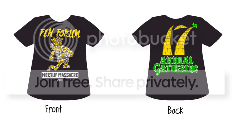
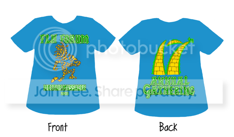
Borderless and bordered. Hopefully we’re getting closer to something everyone can agree on.
![]()
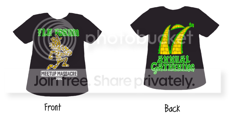
Whoop Whoop Neverthrive :
Psyral, SPOOKYtheFUNGI, scruffy
1:55 pm
January 28, 2016
Neverthrive said
Borderless and bordered. Hopefully we’re getting closer to something everyone can agree on.
Im diggin it just dont like the border but its seems to be a necessity to shape the faygoman
4:09 pm
July 27, 2012
Minor edits.
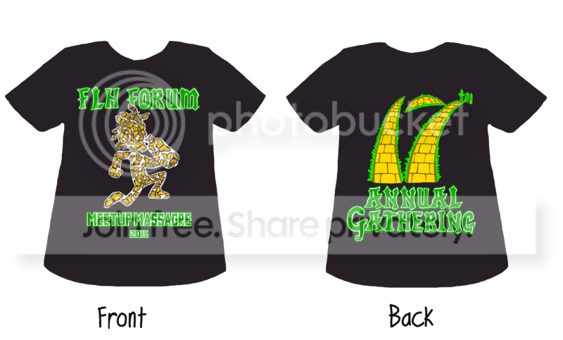
![]()
Whoop Whoop Neverthrive :
SPOOKYtheFUNGI, scruffy
4:47 pm
October 30, 2013
There it is! I see it!
The addition of the grassy borders for the back piece offsets the “Tropicana” look it had. THAT looks fuckin’ perfect! Line stop! (maybe move it up a schosh, :P the silhouettes are still look like they’d end up in the right armpit.)
The matched lettering of the FLH Forum and the Annual Gathering is great!
ABANDON THE BORDERING OF THE HATCHETMAN!!! It looks perfect by itself!
And use the ‘MeetupMassacre 2016″ font as shown in this last minor edit post…. and THAT is a shirt I’d wanna get as soon as I got there to get into pictures! Seriously! Full stop on the fuckin’ process for ME! … for my “vote” ‘er whatever.
Whoop Whoop Cheshyr :
SPOOKYtheFUNGI"Your lack of online social presence makes it difficult for me to predict your needs..." - 2064: Read Only Memories
5:27 pm
July 27, 2012
The shirts are really rough and kinda just there to give an idea. And the placement is super flexible so that’s no big deal.
Also I think it looks pretty cool on blue, bordered and borderless faygoman again.
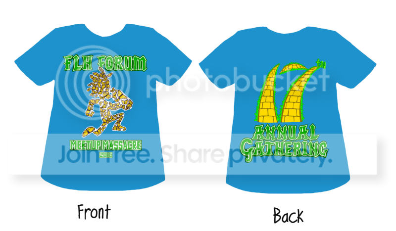
![]()
Whoop Whoop Neverthrive :
Psyral, scruffy
Most Users Ever Online: 1174
Currently Online:
29 Guest(s)
Currently Browsing this Page:
1 Guest(s)
Top Posters:
The Warlock: 11727
King Lucem Ferre: 9104
Old Mr Dangerous: 9080
krunk: 8380
OCJ_Brendan: 6148
Member Stats:
Guest Posters: 755
Members: 6280
Moderators: 6
Admins: 2
Forum Stats:
Groups: 5
Forums: 28
Topics: 12376
Posts: 246709
Newest Members:
CarbixTools, charliecl, parchedgam, creatorpixelModerators: GanjaGoblin: 2893, Psyral: 4297, bozodklown: 394, scruffy: 11447, PunkRockJuggalo: 6559, Pigg: 6492
Administrators: admin: 1, ScottieD: 845